Tuesday, 29 March 2011

Classroom Makeover in WARLI ART FORM

After the stress involved in relocating, one definitely needs a reward. I chose to watch a movie. Coincidently... it happened to be Julie and Julia by Julie Powell. I definitely knew about this book....,but was not aware that this was about blogging. As I sat watching the movie, tears rolled down my eyes and I began to realise...how much I missed blogging. That is when I decided to write and update my blog continuously. This post is dedicated to Julie Powell and Julia Child.


This post is about how we transformed an interior design classroom into a fascinating world of warli art. I thank all my students wholeheartedly for extending their support and showing interest in this project of mine.


As you can see, its a normal white boring classroom. Unfortunately, in an excitement to re-do the room, I forgot to take any before images of the room. This is the only one that I have and you can see a student working here.

Many blogs have already spoken about warli art. So, I think I will not venture deep into it. But a small note for the novice. Warli art form is a kind of painting found on the mud houses of some tribal groups in Maharashtra. The paint forms depict their daily life scenes in an attempt to showcase their culture. I found a lovely blog titled http://warlipaintingsart.blogspot.com/. Please check this for an extensive research on warli paintings.

So, after the makeover......
the beams that run through the room..........


While the beams and one wall were painted with warli, we chose to keep the other walls in a light green colour and adorned the walls with some colour boards.


I promise all my readers and followers who have been patiently mailing me everyday to update my blog that I will regularly update this blog with more and more interesting and useful articles. I also encourage every reader of mine to send me a message on what you would like to know from me with respect to interior design and decoration.

Linking this post to the July Carnival at The Key Bunch....

Monday, 3 January 2011

How I Surprised my Spouse !!!!!!

Dear Readers!!!!
WISH YOU ALL A VERY VERY HAPPY NEW YEAR 2011 !!!!!
This is the time of the year when people in my house are busy exchanging gifts. The reason being... all of us are capricorns. While it is easy for my hubby to think of a gift for me.... It is really hard for me to think of a suitable gift for him. I have surpassed the usual watches, phones, perfumes, shirts, T-shirts, wallets etc., I was desperate for an unusual gifing idea. This was when I saw the ad of asian paints royale play - SURPRISE YOUR SPOUSE on TLC Channel.
My hubby has always been complaining about the wall paint of one of the rooms in our house. It was mint green. Our intention of painting this colour was to give the room a refreshing feel...something that blends in with nature. Unfortunately after this exercise, we realised that no matter what shade or tint of green you paint....it can never look natural. One of the reasons could be that we are so used to seeing the leaves in nature and each of the leaf comprises of various shades and tints of green. Try holding a leaf in your hand and you will agree with me on this.
I decided to surprise my husband by giving this room a whole new look. I had a very short time and this whole process had to be done without the knowledge of my husband. Now, this was the tough part. This meant that the whole makeover had to happen on the same day. I then contacted asian paints helpline. They first took my contact details. The closest asian paints home solutions representative then called me to find out my requirement. The representative visited my home with all the catalogues of asian paints royale play. I really appreciate their professional approach.
Since I wanted some kind of a textured effect. I chose combing technique with base coat as MANGO YELLOW and topcoat as GREENERY. You can see the pictures of the step by step makeover of the room. My husband returned home from office and was shocked and surprised at the same time. He never expected to see something change all of a sudden. He had seen a green wall in the morning and to see a completely changed wall in the evening is definitely a surprise. Initially he refused to believe that it was the paint effect as paint generally takes a long time. He convinced himself that it could be a wallpaper. Honestly, the effect is marvellous and it indeed looks like a wallpaper.
Yahoo.............I successfully surprised my spouse. I am so happy and thank asian paints for the quick makeover. Here are a few pictures of the makeover........


The mint Green wall getting ready for the makeover

The base coat in Mango Yellow
Combing effect being done on the wall
A closer look of the same


The wall after the effect resembled a wallpaper
Loved the whole process which happened so effortlessly.............
ALL THANKS TO ASIAN PAINTS
Hope you all enjoyed this post.......
Please do leave your comments.....

Friday, 5 November 2010

Diwali Inspired Post.....

Hi Readers !!!!
WISH YOU A VERY VERY HAPPY DIWALI. MAY THIS DIWALI BRING IN LOADS AND LOADS OF HAPPINESS THROUGH HEALTH & WEALTH.
Here are a few pictures of diwali celebrations at my home.


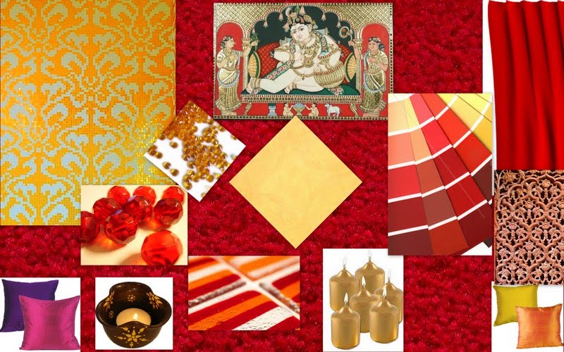
Inspired by the same....I have created a diwali inspired decor for your living rooms. Please take a look...
Clockwise from top left:
"Gold Mosaic" from Bisazza, "Tanjore painting" from Tarang Gallery, "Red silk" brought from a local store can be stitched into drapes, "Carpet" from First impressions, " Wooden jaali or lattice" can be done by a skilled carpenter, "Silk cushions", "Striped glass tile" from rdwglass, "Handpainted diyas" from rural handicrafts, "Perlato gold tile" from marbonite, "Gold coloured candles" from crafted candles, "Vases" from asian design house, "Paints" from asian paints.

Thursday, 2 September 2010

Marquetry....or Wood inlay work....

On my recent trip to Mysore, I stopped by at a place called Srirangapatna. It had been years since I visited this old and famous temple. Although I had admired this town...this time more from a designer's perspective. Today, I would like to discuss about an artwork, that I have grownup seeing in most of the traditionaly decorated houses in Mysore and around. This artwork by the local artisans is called MARQUETRY. In simple words...we call it the wood inlay work. This is similiar to Marble inlay work. Traditionally, Mysore artisans were known to work with rose wood and ivory. Lovely rosewood doors with ivory inlay are still preserved at Mysore Palace and is a treat to the eyes. These doors have won many accolades at the international fairs all over the world. Today, rosewood and ivory are very expensive and so is subsituted by other compressed woods. The artisans have to spend hours of work to detail out a master piece with intricate patterns. Marquetry is the art of inlaying wood or ivory on another wooden surface to form a pattern. Generally, themes such as elephants, florals or a nature scene are typical of Mysore artisans. I spotted a few such pieces from a street artist here. Please take a look at them. Sleek bed side tables, center tables, art frames, coasters, Polster beds are an excellent choice for Marquetry.

Thursday, 26 August 2010

Monochromatic Scheme....

Hi Readers,
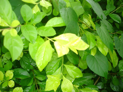
Back after a long hiatus and hope to stay inspired for sometime. I have loads of articles to update but have very less time these days. When I started this blog....little did I know that I would get so busy. Anyways, this is an interesting writeup about my favourite topic - "COLOUR". I want to share some info on the different colour schemes possible. To begin with...I want to talk about a simple yet complex colour scheme which is Monochromatic. "Mono" means one and "Chroma" means Colour. This scheme is all about handling a single colour in various tints...tones and shades. To make this more clear, let us take an example from nature. Please see this picture below, notice the variations in colour. A close observation will reveal the different tints, tones and shades of green. This is the best example to demonstrate a monochromatic scheme.


I created a collage of some of the green things I had at home. This exercise helps in understanding this scheme better.
Now to derive the colour palette from the above pictures..... (Photo Courtesy: click here)
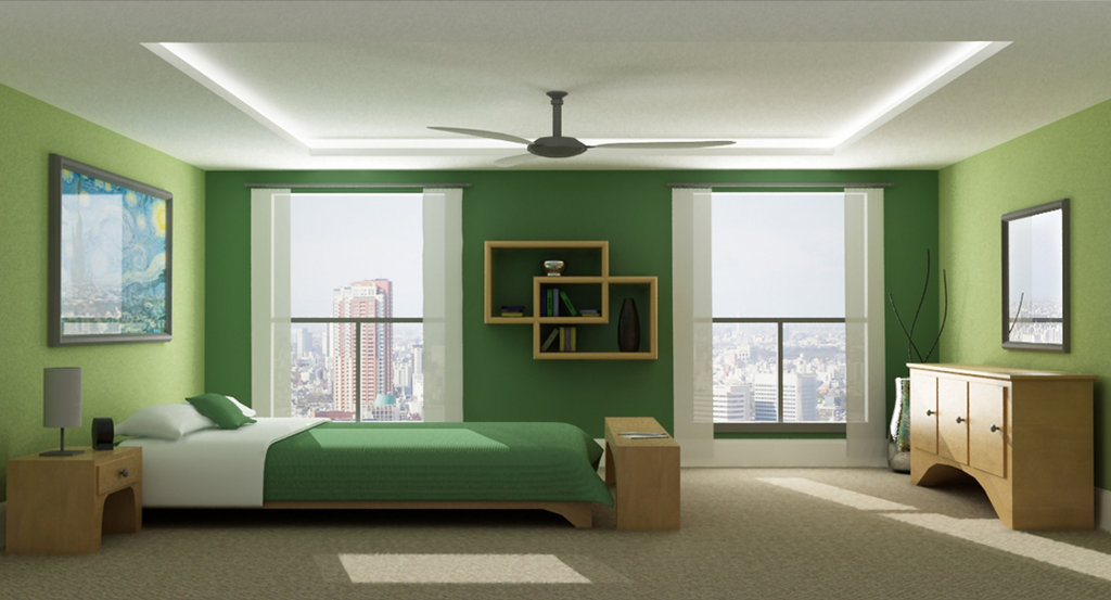
Now for some examples of interiors in the same monochromatic green colour.

(Photo Courtesy: Click here)

(Photo courtesy: click here)
Hope you all enjoyed this post. Will post some interesting works of my students shortly.....

Wednesday, 2 June 2010

Colourful Tiling Ideas...

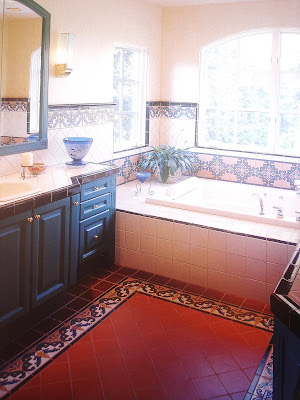
Sunset Books Inc. based in California have a series of books on interior designing. They have this series called "ideas for Great" which hosts a lovely collection of books ranging from different ways of Tiling, Wall systems, window treatments, Kitchens, home offices, patios etc., Their books are filled with lovely pictures, easy to understand and teaches the basics to any novice in this field. I cherish this book "ideas for Great TILE" and here are a few pictures of creative tiling from this book. ISBN 0-376-01677-9
Have a great day ahead!!!!!!!

Tuesday, 1 June 2010

How to choose your colour palette from something you have liked..

Hi Readers,
After reading the post on My inspirations from Maddur....many of you have written to me asking how to make use of the inspirations....the simplest answer to this is....you can choose the colour palette from something that has attracted your attention.
Assume that you have liked something ........it could be a landscape or simply a group of objects. If you have captured it on your camera....it means you have liked it. This post focuses on using your picture (any photograph of your choice) to derive your colour palette.

Please take a look at the following examples:

This is a simple picture of a terracotta duck against a grass background that I captured on my tour to Mangalore. If I had to pick out my colour palette from this picture.... then it would be.....Shades and tints of green and ofcourse terracotta brown. It is very important to note the proportions of the colour. How much of what colour is in the picture?. In this picture, the proportion of green colour is more than that of brown. Green is acting as a background colour. Keeping all this in mind, I have created this picture from my architectural software. Please do not mind the slight difference in the colours as the 3D image differs slightly fromt the intended colours.


From this picture, I derived the following colours: Black, Rust Brown and Majenta or Pink.


Since Pink in the picture is against a black background and is focal point of the picture, I decided to use this on my sofa and the carpet. If you have noticed the above picture...there is a tinge of rustic brown on the vessels...I decided to use this on my bookcase and the vase....you can ofcourse extend this to the door and window frames as well.
I hope you all liked this post. If you have any pictures and want my assistance in deriving a colour palette for the same....I would love to do it. Do query me about any info you need on this post.