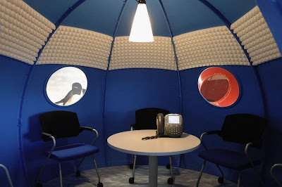
I was thinking about spotting some pictures to explain the use of contrasting textures. That is when I came across some beautiful pictures of some office spaces that I would like to share with you. The first 2 pictures that you see is a modular office furniture system designed by Aksusuardi Studio. For explanation of the details of this furniture, please click here.

 This is the office of Maycreate design lab. I love the way, the designers have played here with colours and different textures. For more information and pictures of this, please visit http://www.thisaintnodisco.com/
 I think most of you are familiar with this one. Anyways, for people who are not aware, these are some unusual office spaces from Google. I love them.... For more info and pictures on this, please click here.


5 comments:
wow... this is just what i needed Vasu... We're moving offices and we've been looking for ideas... Its not going to be that funky... but somewhere between the traditional office and an extremely advertising or music type office...
In our offices in the UK, they've got chill out rooms with leather massage chairs, chill out zones that have billiard tables, table tennis & play station, we've also got a proper gym... which is great...
No... dont get excited... here its going to be nothing like that... But a new office makes the most difference!!
thts wat u call all work and no play goes out of window.....welcome to 21st century ;)
like your ideas and cocepts......very interesting
Thankyou for your comment on my blog. I'm so glad to have found your blog. I love the jeweled chair!! Wonderful idea!
Since I enjoy the unusual and different, I think the best office space is the one that makes you forget you are working :-)
Definitely, the Google offices are outstanding.
Post a Comment